Design Guidelines
The way we talk about DeSales shapes the way people feel about it.
The brand voice is welcoming: We want our audience to lean in and want to know more. They should feel inspired and intrigued, and on occasion, surprised and delighted. When writing, ask yourself: Who's the audience? What do we want them to think, feel and do? What is the next step we want them to take?
For guidelines on grammar, punctuation, spelling, and usage in materials produced by DeSales University, please refer to our general editorial style guidelines.
Logo Guidelines
-
Logo
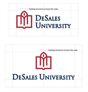
The DeSales University logo may never be altered, adjusted, or amended from its current form.
The logo may be shown in dark blue and red (2 color), dark blue (one color), or white (1 color). No other colors or combinations may be used.

-
Logo Don'ts
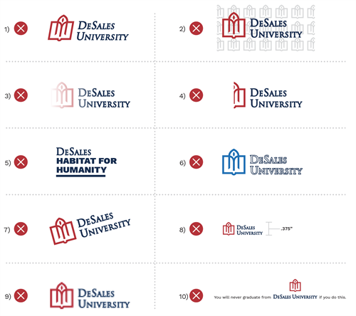
Respect the logo! You should never attempt to recreate or alter it in any way. Here are some important “Don’ts”:
1) Do not distort, stretch, compress, or angle the logo.
2) Do not place the logo over a design, texture, pattern, or any confusing background.
3) Do not add shadows or gradient fills to the logo.
4) Do not crop the logo.
5) Do not use elements of the logo independently.
6) Do not make any color or outline changes to the logo.
7) Do not rotate the logo (some specialty items such as campus banners are an exception.) 8) Do not reduce the logo smaller than .375” in height.
9) Do not use a low-resolution version of the logo in which the logo becomes pixelated or blurry. Always use a high-resolution version of the logo, and only use logos supplied by Marketing and Communications.
10) Do not use the logo in a sentence.
Connect Wordmark and Logo
Typefaces and Font Usage
Typography is an effective tool that adds visual tone to complement your message.
The brand fonts are permitted in marketing and communications materials.
Primary Typefaces
-
DM Serif Text
DM Serif Text
DM Serif Text is the primary headline font. Its warm letterforms help capture the spirit of the University. For headlines, it may be used alone, or its boldest weights may be paired with Work Sans for emphasis. Don’t be afraid to use it large. However, for more formal audiences, you can match its size to the Work Sans portion of the headline. Tip: to achieve a virtually equal size to the Work Sans portion of the headline, set it at 5 points larger than Work Sans.
Regular 400
DM Serif Text
Ideal for:
- Headlines
- Callouts
- Facts/Rankings
-
Work Sans
Work Sans
Work Sans is used for the less important part of a headline as well as subheads, lead-in, and body copy. The Work Sans font family was designed by Wei Huang. It is based loosely on early Grotesques, such as those by Stephenson Blake, Miller & Richard, and Bauerschen Giesserei. It's a sans-serif typeface that features 9 weights plus italics. It's a Google font and can be downloaded for free.
Light 300
Work Sans
Regular 400
Work Sans
Bold 700
Work Sans
Ideal for:
- Subheads
- Body text
- Callouts
- Captions
-
Quincy
Quincy is only available for the Marketing and Communications department.Quincy
Font Usage
-
Example One
DM Serif Text Regular
Work Sans Medium
Work Sans Bold used for lead-in. Work Sans Regular used for body copy.
This is an
emphasized
headline.and this is the de-emphasized part or subhead.
The sans serif font is used for all body copy. As ni ium id qui optame volo excerchit exceaque denianto magnat. Soluptaquame neturesequis eaquam, sendae nemolup tatesti volupie nitatium sequiae dolupta sperum fuga. Offic tem qui iumquam rem in poreium lacimporest, nit renis que lacerro.
-
Example Two
Work Sans Light
DM Serif Text Regular
Work Sans Bold used for lead-in. Work Sans Regular used for body copy.
This is the de-emphasized
or subhead part of theheadline.
The sans serif font is used for all body copy. As ni ium id qui optame volo excerchit exceaque denianto magnat. Soluptaquame neturesequis eaquam, sendae nemolup tatesti volupie nitatium sequiae dolupta sperum fuga. Offic tem qui iumqua rem in poreium lacimporest, nit renis que lacerro.
Photography
How to capture "CONNECT"
DeSales's campus is exceptionally bucolic, but if it's shot in a traditional fashion, that difference may not stand out. Reframe how you think about space in service of more dynamic imagery. Interesting angles/ perspectives need to come into play to avoid photos looking too flat and boring. The goal of every photo should be to reflect the personality of the students while letting your Salesian values shine through.
Successful photos should:
- Be mindful of the story you are telling. Get up close and focus on a student/students to make the viewer feel like they're in the photo (use shallow depth of field to really focus on the subject and bring the story forward.)
- Capture a student/students doing something interesting in a space/environment from an interesting angle and perspective.
- Highlight or use unique architectural elements/campus environments and photograph them from interesting angles/ perspectives.
Videography
How to capture "CONNECT"
- Tell a story. A video shoot is about so much more than capturing what’s happening – it’s about creating a narrative. Every time we plan a shoot, we should be using our overarching brand themes and messages as guideposts. We always want to make sure the shoot reflects the specific story we’re trying to tell while connecting to DeSales’s larger brand.
- Make it connect. We want/need our video to match the rest of our marketing materials. Go for warm, human shots and active and engaging subjects.
- Be intentional about casting. Compassionate, energized, joyful, optimistic, engaged. When choosing DeSales people to feature in video, consider their comfort level on camera, their energy, and the visual translation of their work or story. They need to feel like people who embody connect. Chances are if they’re pumped about being in the video shoot, they’ll be comfortable on camera.
- Think diversity on all fronts. It’s about more than just choosing a diverse group of people when casting. (That’s critical, but it’s only part of the picture.) To plan for a shoot that offers variety, represents the many facets of the University, and serves our needs over time, we need diversity in ALL things: spaces, shots, stories, programs, people, colors, sounds.
- Zoom in. Zoom out. We always want to capture a variety of shot types – close-ups, drone shots, action shots, portrait style shots, wide shots, POV shots. Changes in perspective help create visual interest and build emotion. If all of the shots feel similar, our videos will start to feel expected. The more types of shots we have to work with, the more we’ll be able to produce videos that surprise and delight.
- Build for sound. Always look for ways to incorporate audio cues that can make our video even stronger. Evocative music. Fun sound effects. Get creative! What are the most iconic or special places on campus? Close your eyes. What are the sounds of the place? Use them. And don’t forget that using sound with graphics and still photography is another way to create compelling video.


